Ever since I bought my Wacom tablet, I’ve been working pretty exclusively in a digital environment. It really makes a lot of things easier for me. But back before my tablet, I would hand-draw the lines for an image and only add the colors on the computer. I know lots of artists prefer to work that way and I’d like to share a couple of tricks I know to get better results from that process.
First off, you need to scan the drawing to get it into digital format. I always scan this sort of image in greyscale at 300 resolution. If you’re going to print the image, 300 dpi is the very minimum you want to work with. It doesn’t hurt to make it even higher.
Let’s start with a challenge. Let’s say that the image is too large to fit on your scanner’s bed. As long as you have Photoshop, that’s not a problem. You can use the photomerge feature. I’m on Photoshop CS5, but Photoshop Elements also has it.
Scan in the two halves (or four corners) of the image so that they overlap at least some at the edges. Save all the files somewhere you can get to and open them in Photoshop.

Then go to File->Automate->Photomerge. Since they’re already opened, just click the button for Add Open Files. Alternatively, you could also select the image files from your folders. Choose the Auto radio button, if it’s not already selected. Click OK.

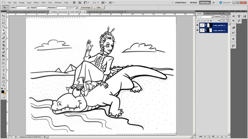
Once it’s finished, merge all layers and you can close the original files.

Save this merged image file before continuing.
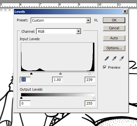
Make sure the image mode is RGB color, then clean up your lines. Adjust the levels so that the lines are pure black and the page is pure white. Or, that’s assuming you want your blacks to be pure black. If it’s more of a pencil sketch, you might want them to be 50% or 75% black. Whatever. Regardless, the white needs to be 100% white. Don’t go overboard adjusting the levels, though. You don’t want to make the edges of the lines too pixelated. You want to preserve those smooth shades of grey on the edges of the lines.
Erase any smudges, stray lines, etc. that you don’t want in the final picture. You won’t be able to easily adjust the contrast later, so make sure to get the lines as you want them now
As always, remember to save often.
Now it’s time to use the most useful free plug-in there is for an illustrator working with line drawings: Mike and Yael’s Kill White. First off, make sure that you’re not working on the background layer. If you’re not sure, double-click on the layer to convert it to a regular layer rather than a background layer. Open up the Kill White filter and run it.
Edit: This is a pretty old post.
I’ve since learned a better way to remove all the white from a layer using the Channels tool. It works just as well, but without having to open PixelBender and run an add-on filter. I talk about that here. But the Kill White filter will also work. There are other techniques that work also.
I also now know that you can make the white invisible by just changing the blend mode to “Darken”. (“Multiply”, “Color Burn”, and “Linear Burn” have similar effects that will also make white invisible and which you might find useful.) Changing the blend mode is probably the easiest thing to do. However, there are sometimes reasons you might want the white actually removed rather than merely invisible. I usually pull the white completely out, even if I don’t strictly need to. I figure, why keep it if you don’t need it? Occasionally it can interfere with filters or the selection tool or something. So, I just get rid of it if I don’t need it.

Now you have a layer with all the white converted to a transparency.
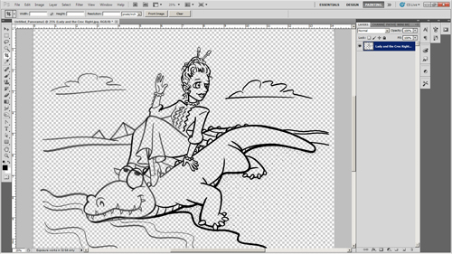
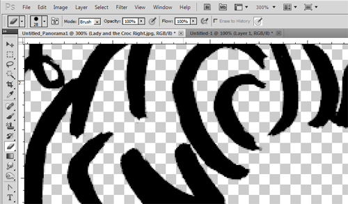
Notice that it converted it cleanly? There are no white edges around the lines. The filter will actually convert a 50% grey pixel to a pure black pixel that’s 50% transparent. Same thing with colors. That means no ugly white edges. I’ve blown the image up to 300% below to show that.

Now you have your line layer. Create a new layer, fill it with white and position it underneath your line layer. Think of this as your paper layer. Create another layer and position it between your line layer and your paper layer. This is your color layer. Paint your colors here and they’ll be underneath the lines, but on top of the paper. For further flexibility, you can create a new color layer for each individual color you use. That way you can easily isolate each color and adjust it separately as necessary as you work.
Here’s another close-up. See? No White edges.
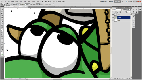
 And there you go. That’s how I color a line drawing with Photoshop. I hope this makes someone’s life easier.
Post Edited Nov. 4, 2012: Minor text changes and images added for Illustration Friday’s reblog.


 I now have 21 free bumper sticker designs on my website. I just finished adding a bunch and updating the old ones a bit. They’re all designed to promote responsible driving by encouraging people not to use their cell phones while driving. This is an issue I feel very strongly about. No conversation is worth someone’s life.
 Aliyah, a fan who saw a previous post on this blog, requested “a cartoony crocodile lying on a river bank.” I’m not sure if this is exactly what she meant, but here it is.
 I was looking around for a pad with those three-line ruled sheets for little kids to use for practicing their handwriting. Of course, since I was looking for them, they weren’t at any of the stores I normally go to. I was debating making a special trip to somewhere I knew had them when I thought, “Hey, why don’t I just make some on the computer?”