
Inktober #28 was Float. Here’s that one colored in.
Inktober #28 was Float. Here’s that one colored in.
So, here’s the new version of the Kissing Story page I posted before. If you remember, there was some concern that the public display of affection was too much for the children’s market in the original version. So, here is a new version with the parental kissing off-panel.


This is a tribute to Bree Newsome, the activist who scaled the flagpole in South Carolina to remove the Confederate Flag. Drawing her as a superhero is apparently a thing just now. I liked the idea, so I drew her in a Spiderman pose on that flagpole.
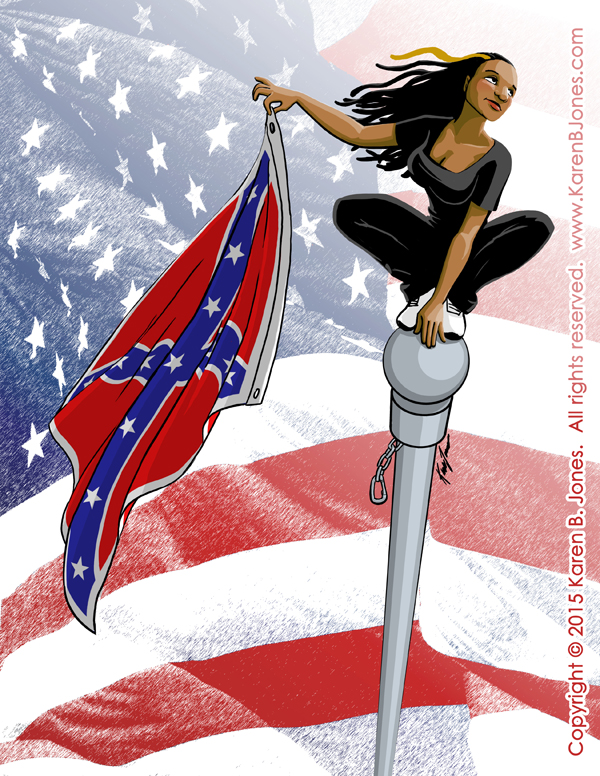
Also, Bree Newsome would be an excellent name for the mild-mannered alter ego of a superhero.

Here is my entry for the Tomie dePaola Illustration Award given by the SCBWI. The prize is a trip to New York to attend the SCBWI winter conference, lunch with Tomie dePaola (he’s been an illustrator for over 40 years and illustrated nearly 250 books), and some sort of little award presentation. 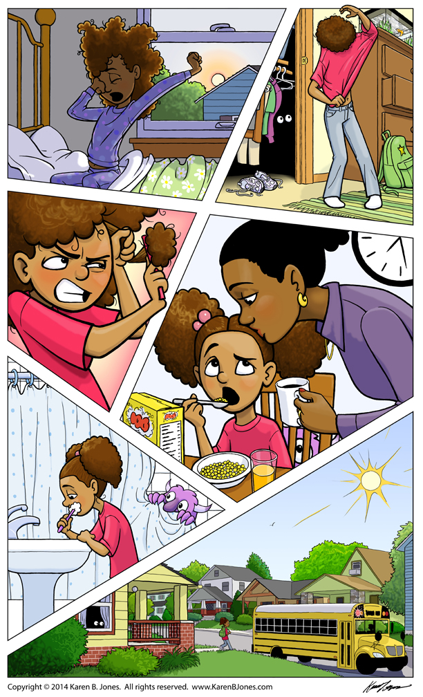 The prompt was:
Visual sequence is key to conveying feeling, action, storyline, interest and character, especially in children’s book illustration. One of the hardest things to do is to know your character so well—what he, she, or it looks like, how they move, how they project emotion, and at the same time to make the character immediately recognizable and consistent —all without resorting to a generic depiction, but making sure your character has charm, individuality and special qualities that make young readers fall in love with them. All of this is the same whether your character is human, animal, and yes, even vegetable! (Maybe inanimate as well) The task is to create a six-panel sequence that has a beginning, middle and an end that is obvious, featuring a character of your own invention. It can be funny, sad, dramatic or ordinary, but interesting and with lots of invention and finesse.
So, this piece was designed to be a bit of a sampler. It has close views and distant views, a variety of expressions, a couple of challenging poses, a consistently drawn character (I hope!), and a bit of humor in an otherwise ordinary daily routine.
The girl is biracial because biracial children are under-represented in children’s literature and it allowed me to have her really fighting with her hair in panel 3. Two birds, one stone.
The monster is there because I had some empty space in the panels and it added humor and complexity. And I was a little bored. Hopefully, though the series has a clear conclusion, you’re still left wondering, just a little, what’s the deal with the monster?
This is merely round 1 of a two-part contest. The second part won’t be announced until the 10 finalists are chosen. Wish me luck!
Update:
I didn’t get into the semi-finals, which is disappointing. They showed the semi-final entries, and I think most of them were better than most of the ones for last year’s prompt. So, congrats to everyone who entered and made it into the second round!
For future reference:
I think this competition is looking for illustrations targeting the preschool age range and he likes humorous, whimsical illustrations. I think I should have entered a reformatted version of this or a colored, more finished version of this and I might have done better.

Perspective on something geometric, like a building, is much easier to do than perspective on something organic, like people. So, this was a challenge. I’m not 100% happy with it, but I’m sharing anyway. Enjoy. ![]()
I don’t know why, but I’m really proud of that contrail. That came out well, I think. ![]()
I really liked that comic book page I did for Illustration Friday, so I decided to expand it. This is the 2-page spread that would go immediately before the one in my previous post. Click the image for a larger version. I have an idea what would come next, but I’m not sure if I’ll continue the series. I guess it depends on what I feel like and whether people want to see more.

Lucky you, two Illustration Friday pieces this week. Don’t get used to it. 🙂

EDIT: This would be page 3 in the series. The next post has page 1 & 2.
