

Because llamas have wool.
Because llamas have wool.

The double heart is mine. The font is Action Man, which isn’t mine.
Another good variation would be to use the word “forever”, with the “o” being the double heart.
A drawing of the old stone building (mill?) out at Lake Olathe south of Dennis where Cedar Creek flows under the bridge into the lake. This is to fill an art challenge for the Olathe Visual Artists Association (OVA).
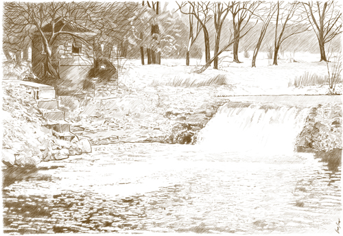
I originally tried to do this as a full-color digital painting, but working on it just felt like pulling teeth. When I started over and decided to try with thin brown lines instead, something just seemed to click. I’m not sure if it’s that good, but it satisfied me so much more than a painterly, colored piece would have.
A rock wall near the lake shore in Fish Creek, WI from my summer vacation. Just got around to drawing it.


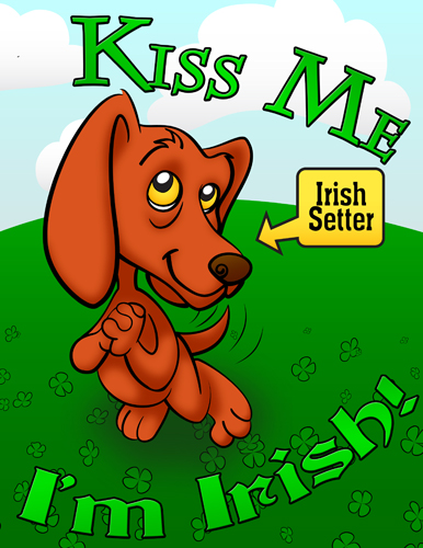
I wasn’t entirely happy with the last one. I like this one better. It’s meant to be the cover on a greeting card. Next up: The interior spread! 🙂
I certainly hope the CS6 version of Illustrator is much better with fonts than the old version I got a hold of. As it is, I’m using Photoshop CS5 for the text, and Illustrator CS2 for the vector graphics. It IS better with vectors than the quasi-vector tool (paths) that Photoshop has, though. So, that’s something. I’m also learning how best to use each for different parts of the image. I may break down and buy the new version of Illustrator, but only if I start doing enough vector work for it to be worthwhile. In the meantime, I’m just using it as a learning experience.
So, I’m trying to learn Illustrator. Here’s today’s results. The fonts are Chaz, Ache-Condensed, and Brandywine-Extended. I didn’t make the fonts, but all the rest is mine.
I’m not really that happy with Illustrator. It’s supposed to be the thing to use for vector graphics and text, but I’m only liking the vector tools. The text tools aren’t really working well for me. I ended up saving the image to a PDF and opening it up in Photoshop to do the text. Now, the disappointing text tool performance might just be because it’s an old version of Illustrator. Or it might be because I’m still learning my way around. *shrug* Oh well, it’s good for me to learn it, anyway. 🙂

I just downloaded Adobe Illustrator
and this is the first thing I did with it.

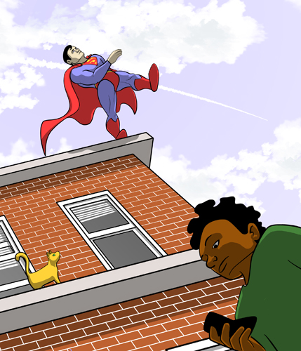
Perspective on something geometric, like a building, is much easier to do than perspective on something organic, like people. So, this was a challenge. I’m not 100% happy with it, but I’m sharing anyway. Enjoy. 
I don’t know why, but I’m really proud of that contrail. That came out well, I think.

