
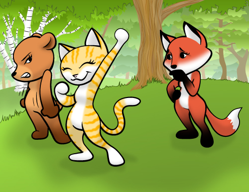
So, I asked for critiques on this and thank you so much for the suggestions. I made some changes and here’s the revised illustration.
So, I asked for critiques on this and thank you so much for the suggestions. I made some changes and here’s the revised illustration.
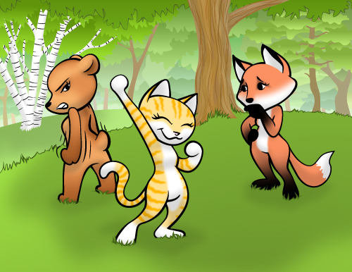
This was an experimental piece. I was practicing several things.
– Cartoon females in this sort of bit-headed cute style.
– Expressive poses (body and face)
– Full background
I’m not really sure what’s going on in this scene except that it’s probably not a good idea for a cat to tick off a grizzly.
Since this was an experiment, I welcome critique and feedback on this piece.
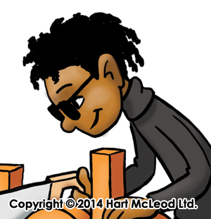
 I was asked to revise this to make both characters non-white so as to increase the diversity of the illustrations in the textbook. I left the girl as she was, since she was already brown-skinned. The boy became black with dreadlocks. (Because dreadlocks are fun to draw.)
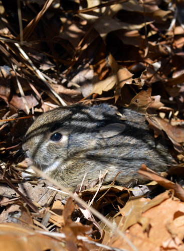
Here’s leveret photos I took the weekend before last.
This little guy (and two others) were hiding under a plume of ornamental grass in my backyard. Hubby found them when he went to trim it. So, I laid in the grass for awhile taking pictures. They were too little to know what to think of me and didn’t run off like they should have. They were actually pretty good models and even let me move grass and leaves off of them to get a better shot. Even when they did eventually get fed up with me and ran, I just picked them up and put them back and took more pictures.
They were actually more patient than my own kids.
Eventually I let them go with (probably) a rather confused idea of what humans want from hares.


Open in Photoshop. Auto contrast, auto color, auto tone–hey, that’s weird. The auto tone made the blossoms look great, but the background look blue. So, then I masked out the blossom and used the auto tone on that, but only used the auto contrast and auto color on the background, with just a hint of desaturation.
I love daffodils. They’re my favorite flower, even though generally I’m not a huge fan of yellow. But on daffodils, I make an exception. I’m usually disappointed in my attempts at daffodil photography (they never seem to want to face the camera the right way) but I think I like this shot. It looks cheerful, like a daffodil should. 🙂

Okay, so this has been fiddled with, but not that much. I masked out the blossom and upped the vibrance and saturation by 10 each. Then I lowered the saturation for everything else by 40-something.
I really like the striation on the petals between the red and almost-beige parts. I thought it was interesting.
It’s also not a standard tulip. It’s some fancy breed with funny petals, but it’s still a tulip.
I was playing with my big zoom lens a week or so ago and came up with these. Usually there are too many leaves to get pictures of the birds way up there, but it’s spring, so I got some halfway decent shots. And I finally have a camera that’ll let me crop a shot and still have a decent size to do something with it. Yay!
You can’t see it because these are low-res for-the-web versions, but there’s actually enough pixels to print if I wanted to. 🙂
Of course, blackbirds aren’t all that photogenic, but I did what I could from the ground. 🙂


Here’s the same image as a night scene with the aurora borealis.


