
After I finished taking pictures of the hawk I decided to take a few flower pictures while I was out in the yard anyway. There aren’t that many flowers out in my yard this time of year, but I found a few.
Some of these are available as prints.
After I finished taking pictures of the hawk I decided to take a few flower pictures while I was out in the yard anyway. There aren’t that many flowers out in my yard this time of year, but I found a few.


Some of these are available as prints.
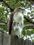
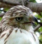
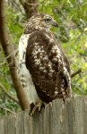
He sat there for over an hour and let me get as close as about 20 feet from him. I think he’s a red-tailed hawk, but I’m not sure.


When I was in Wisconsin this summer, I visited Fish Creek the day that the Door County Plein Air Art Festival was in that town. There were artists all over the place painting pictures of the picturesque scenery around them. I had two little kids and a husband with me, so all I could do was snap photographs. One scene that caught my eye was this stone and wrought iron fence. I took a picture of it. So, two months late, I post my digital water color, plein air style picture inspired by that day.

Here are two logos I recently designed for a client of mine.
![]()
![]()
So, the first one played with the ART in her name to reinforce the idea that she is an artist. The accent color would be changed to match whatever accent color she ultimately chose for the site as a whole. The client didn’t like this logo because she thought it was too whimsical.
The second was created after the client found the fonts used on her business card. I played with the positioning of the text and created a divider line that, I thought, matched both fonts well.
I did not create any of the fonts used above. The first one is using Indy 17, Stucco, and Century Gothic. The second is using Little Lord Fontleroy and Paris Normal.
Anyway, I just thought I’d share this.
Did you know that you can run your text along a curved line in Photoshop? Just create a path (I’m not going into how to do that) and then switch to the text tool. Move the curser over the line and it will change the way it looks. Click and type and you’ll be typing along the line. Neat, huh?

I learned about it here.
Here’s a trick you can do with the free Photoshop filter Mike and Kael’s Kill White (which is an awesome filter for several reasons).
So I have a picture of a flower. Nothing special. There’s not a whole lot of contrast and it’s just kind of blah. I tried playing with the contrast and the colors and I just wasn’t happy with it. So, I went back to the beginning and did a trick with Kill White instead.
Here’s the original:

I copied the layer.

And converted it to black and white. That’s Image->Adjustments->Black & White. I played with the filters until I came up with one that made mostly the leaves darker, but the petals stayed bright. This time it was the High Contrast Red Filter, but if none of the pre-sets look quite right, you can manually adjust the filter.

Now you have two layers. A black and white and a color. Here’s where I use the handy-dandy kill white filter on the black and white layer. That transformed all the white in the layer to transparent and you get this:

Almost there, but just a bit too dark. So I adjust the vibrance of the bottom layer. That’s Image->Adjustments->Vibrance. In this case I upped the vibrance and the saturation by 10. Then I upped the brightness by 40 under Image->Adjustments->Brightness/Contrast. Then I adjusted the transparency of the top layer to 80%. And came up with this:

Okay, so maybe not an award-winning photo, but it’s a heck of a lot better than the original.

See what I mean?

Cropping helps.
The reason this works is with the transparent and black overlay, I can up the brightness and saturation of the colors I want without losing the nice dark shadows of the parts I want in shadow. It’s a very targeted way to up the contrast on a photo.
Ever since I bought my Wacom tablet, I’ve been working pretty exclusively in a digital environment. It really makes a lot of things easier for me. But back before my tablet, I would hand-draw the lines for an image and only add the colors on the computer. I know lots of artists prefer to work that way and I’d like to share a couple of tricks I know to get better results from that process.
First off, you need to scan the drawing to get it into digital format. I always scan this sort of image in greyscale at 300 resolution. If you’re going to print the image, 300 dpi is the very minimum you want to work with. It doesn’t hurt to make it even higher.
Let’s start with a challenge. Let’s say that the image is too large to fit on your scanner’s bed. As long as you have Photoshop, that’s not a problem. You can use the photomerge feature. I’m on Photoshop CS5, but Photoshop Elements also has it.
Scan in the two halves (or four corners) of the image so that they overlap at least some at the edges. Save all the files somewhere you can get to and open them in Photoshop.

Then go to File->Automate->Photomerge. Since they’re already opened, just click the button for Add Open Files. Alternatively, you could also select the image files from your folders. Choose the Auto radio button, if it’s not already selected. Click OK.


Once it’s finished, merge all layers and you can close the original files.

Save this merged image file before continuing.
Make sure the image mode is RGB color, then clean up your lines. Adjust the levels so that the lines are pure black and the page is pure white. Or, that’s assuming you want your blacks to be pure black. If it’s more of a pencil sketch, you might want them to be 50% or 75% black. Whatever. Regardless, the white needs to be 100% white. Don’t go overboard adjusting the levels, though. You don’t want to make the edges of the lines too pixelated. You want to preserve those smooth shades of grey on the edges of the lines.

Erase any smudges, stray lines, etc. that you don’t want in the final picture. You won’t be able to easily adjust the contrast later, so make sure to get the lines as you want them now
As always, remember to save often.
Now it’s time to use the most useful free plug-in there is for an illustrator working with line drawings: Mike and Yael’s Kill White. First off, make sure that you’re not working on the background layer. If you’re not sure, double-click on the layer to convert it to a regular layer rather than a background layer. Open up the Kill White filter and run it.
Edit: This is a pretty old post.
I’ve since learned a better way to remove all the white from a layer using the Channels tool. It works just as well, but without having to open PixelBender and run an add-on filter. I talk about that here. But the Kill White filter will also work. There are other techniques that work also.
I also now know that you can make the white invisible by just changing the blend mode to “Darken”. (“Multiply”, “Color Burn”, and “Linear Burn” have similar effects that will also make white invisible and which you might find useful.) Changing the blend mode is probably the easiest thing to do. However, there are sometimes reasons you might want the white actually removed rather than merely invisible. I usually pull the white completely out, even if I don’t strictly need to. I figure, why keep it if you don’t need it? Occasionally it can interfere with filters or the selection tool or something. So, I just get rid of it if I don’t need it.

Now you have a layer with all the white converted to a transparency.

Notice that it converted it cleanly? There are no white edges around the lines. The filter will actually convert a 50% grey pixel to a pure black pixel that’s 50% transparent. Same thing with colors. That means no ugly white edges. I’ve blown the image up to 300% below to show that.


Now you have your line layer. Create a new layer, fill it with white and position it underneath your line layer. Think of this as your paper layer. Create another layer and position it between your line layer and your paper layer. This is your color layer. Paint your colors here and they’ll be underneath the lines, but on top of the paper. For further flexibility, you can create a new color layer for each individual color you use. That way you can easily isolate each color and adjust it separately as necessary as you work.
Here’s another close-up. See? No White edges.

 And there you go. That’s how I color a line drawing with Photoshop. I hope this makes someone’s life easier.
Post Edited Nov. 4, 2012: Minor text changes and images added for Illustration Friday’s reblog.
Today I went to the grocery store and one of the items I needed was half & half. I usually buy the store brand (which comes in a tall cardboard carton), but I saw this instead. This is a quart milk jug. One that looks like a baby version of the gallon milk jug. You can’t see, but it even has the little handle around back, just like the big ones.
And you say, “Yeah. So?” First off, this may be a common container some places, but our local dairies don’t seem to use it. Today’s the first time I’d noticed it and I go to the grocery store all the time. It’s kind of neat.
The reason it’s neat is that I have little girls who are of an age to still play with a toy kitchen set. This quart milk jug is the perfect size to use as an accessory for that. So, once I’ve used up the half & half, my girls are getting a new toy milk jug. They’ve already asked me if they could have it, in fact.
Just a little mommy moment I thought I’d share.
Oh, the image came from the Roberts Dairy website, since that’s the brand I bought. It’s not my photo.
