
A couple of revised illustrations.

A couple of revised illustrations.
Here’s an illustration I made for a workbook for Hart McLeod.

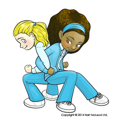
I am somewhat concerned by the blatant workplace safety violations depicted in this illustration. 😉
Here’s some vector fruit I just created in Adobe Illustrator for Hart McLeod. They’re for a textbook.

This image is available at shutterstock here.
I’ve been busy the last couple weeks. Here’s some of what I was working on. These images were commissioned by Hart Mcleod Ltd. for a textbook project for third grade. Click on the images for (slightly) larger versions.


It’s just a simple little stick figure jumping rope, but it’s my first ever animation. I made the frames in Illustrator and animated them in Photoshop. It consists of ten frames at .05 seconds each, so a rate of 20 frames a second. I figured out the timing by singing “Miss Mary Mac” at the tempo that goes with jumping rope and set the speed to match that. (Though it still might be just a bit too fast, I’m not sure.) It’s not very fancy, but I’m proud of it. ![]()

I may have overdone her bouncy hair a bit, though.
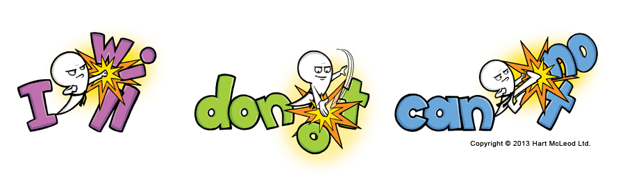
I was supposed to make the apostrophe into a character and have him knocking out the letters to form these three contractions. I decided to make it a karate character so he could use karate moves. Kids like karate. The only thing I’m a little iffy on is making the character white. I made him fully white because a karate gee is all white. I actually tried drawing it in a bit more detail so that the shirt was fully defined, but that just didn’t look right. When I colored the “skin” of the apostrophe, it looked even worse. So, I decided all-white without much detail looked best. The black belt is the important bit, I think.
These are for a textbook project for Hart Mcleod.
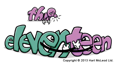
Here are a couple cartoons about combining words in silly ways. I was given very specific instructions on these, including what words to use and what is happening.
These images were commissioned Hart McLeod.
Here’s the finished version of an illustration for Hart Mcleod.
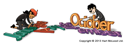
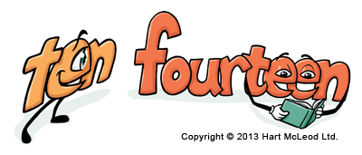
The original discription wanted a poet breaking up and reattaching words to make new words. Specifically January + August = Januaugust and October + September = Octember. Several suggestions on how to do this were given, including making the words into logs that are being cut apart with a saw and nailed together with a hammer.
I chose this interpretation because two poets allowed me to show both the sawing and nailing in one image instead of two panels. It showed that both boys and girls can be poets. It showed a girl using a hand tool, which is always a good thing in my view. They’re beatniks because it’s about the closest thing to a poet’s uniform I could think of. If they’d been older, I would have given the boy the stereotypical beatnik goatee, but I wanted them to be kids, so I couldn’t.
The colors came from the sample layout that went along with the assignment. Not exactly the colors I’d have chosen, but they should go well with the final pages. I haven’t run a test print yet, so the colors may be off a bit.
I think it turned out pretty well. This is the most complex of the images in this project.
I’m working on a project for a text book publisher right now. One of the images they had me do was supposed to be a set of specific words on a thesaurus page that were trying to get off the page. I just heard that they decided to cut this particular image for space reasons, so they don’t need the final. I thought I’d share the rough with you, since I don’t have much else to do with it at this point.
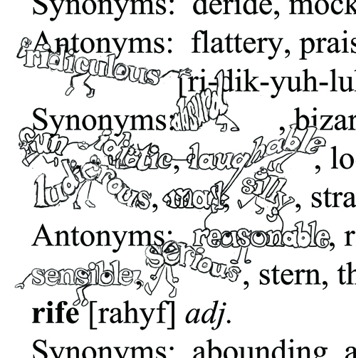
Had I finished it, the lines would be nice and neat and dark, and the cartoon words would be colored.
There are several other images they do still want me to finish and I will get paid for the work I did on this one.
