Radio silence on here usually means I’m busy working on something. This time I’m illustrating a picture book for Entrepreneur Media Inc. The story is about two kids’ basketball teams, the Jack Rabbits and the Sea Turtles. Sports teams always need logos, so here’s a little sneak peek of that detail.
Tag: yellow
Sleeping Tiger

Buy print rights and download.
Onform Sketch
Here’s a sketch I did for the shape prompt for onform sketches.
Sulphur-Crested Cockatoo

Yellow Wildflower

Daffodil
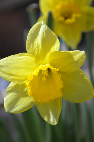
Open in Photoshop. Auto contrast, auto color, auto tone–hey, that’s weird. The auto tone made the blossoms look great, but the background look blue. So, then I masked out the blossom and used the auto tone on that, but only used the auto contrast and auto color on the background, with just a hint of desaturation.
I love daffodils. They’re my favorite flower, even though generally I’m not a huge fan of yellow. But on daffodils, I make an exception. I’m usually disappointed in my attempts at daffodil photography (they never seem to want to face the camera the right way) but I think I like this shot. It looks cheerful, like a daffodil should. 🙂
Red Tulip
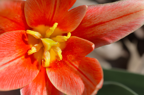
Okay, so this has been fiddled with, but not that much. I masked out the blossom and upped the vibrance and saturation by 10 each. Then I lowered the saturation for everything else by 40-something.
I really like the striation on the petals between the red and almost-beige parts. I thought it was interesting.
It’s also not a standard tulip. It’s some fancy breed with funny petals, but it’s still a tulip.
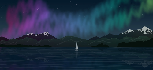
Northern Lights
Here’s the same image as a night scene with the aurora borealis.
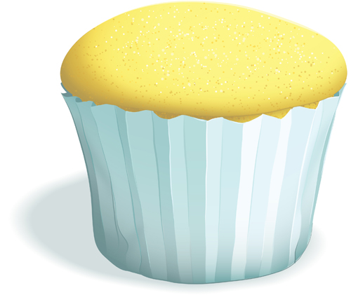
Plain Cupcake
Just a plain cupcake. I’ll decorate it later…
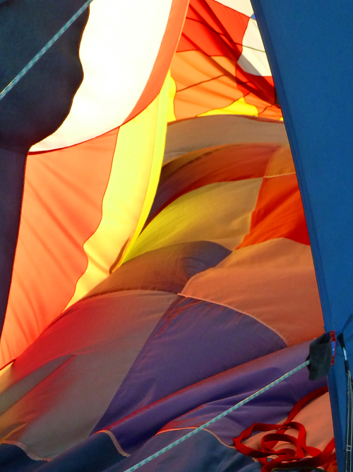
Hot Air Balloon Pics
Earlier this fall a hot air balloon landed right behind our house.