Lunch in Reusable Containers

I recently completed a project for Utah-based Fish for Garbage, a nonprofit organization that mobilizes communities through waterway cleanups and watershed education. They commissioned me to create a series of illustrations for a children’s activity book.

This image was a small spot illustration depicting a metal lunchbox and reusable water bottle. The illustration is used to show an example of reusable containers for lunch that contribute to unnecessary trash in the environment. The water bottle has stickers for the Fish for Garbabe organization and a related fishing organization.

Overflowing Trash Bin

I recently completed a project for Utah-based Fish for Garbage, a nonprofit organization that mobilizes communities through waterway cleanups and watershed education. They commissioned me to create a series of illustrations for a children’s activity book.

This image was a small spot illustration depicting an overflowing trash bin. It will be used to illustrate one way trash can get into the environment unintentionally.

Tangled Duck

I recently completed a project for Utah-based Fish for Garbage, a nonprofit organization that mobilizes communities through waterway cleanups and watershed education. They commissioned me to create a series of illustrations for a children’s activity book.

This image was a small spot illustration. It was based on a previous illustration I created as a portfolio piece depicting a girl cutting a balloon string from a tangled duck. That’s the illustration that initially attracted the client to my work. In this case, the duck was drawn to be a mallard.

Remember, balloons are fun, but if they get out into the environment, they can be a deadly hazard to wildlife which may swallow or become entangled in them.

Spot Illustrations

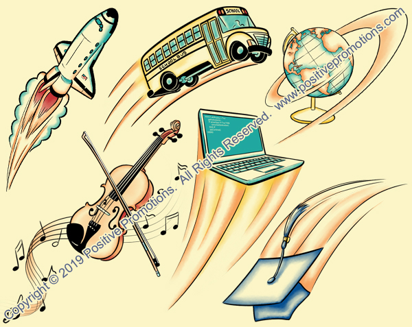
This week I had a rush job for Positive Promotions. They needed 6 spot illustrations for use on the cover of a student planner. Here’s what I came up with.

Spot Illustrations for Student Planner

Boy Reading Published in SCBWI

So, I received my copy of the SCBWI Bulletin in the mail yesterday and I found out which of my images they picked to publish. Turns out it’s Boy Reading, an image I sent them in May of 2012. Yay!  So, when they say they hang onto artwork to use later, they really aren’t kidding! smiley 15

tearsheet 550

Published in the SCBWI Bulletin

I got a check in the mail from SCBWI. So, I guess that means they’re running one of my pieces in the Bulletin. I wonder which one. I guess I’ll have to wait for the issue to come out and I’ll see.

SCBWI Bulletin

scbwi 200I’ve just received an email telling me that one or more of my pieces will be used in the November/December 2014 issue of the SCBWI Bulletin.  I’m not sure which pieces were chosen yet because I’ve sent them several recently, but it’s always nice to get into this publication.  They’ve published me twice before.  SCBWI stands for the Society of Children’s Book Writers and Illustrators and is a publication for its members.  Illustrators for their issues are chosen from submissions sent by their member illustrators and are paid a nominal fee for one-time publishing rights.  It also gets me some exposure on a national level that I don’t normally get.

So, that’s very cool.   I’ll post again when I find out which images they chose.

Verrückt at Schlitterbahn Illustration

Here’s a spot illustration I did for the August issue of 435 Magazine.  It was for an article about the new Verrückt water slide at the Schlitterbahn water park.  The slide’s billed as the world’s tallest waterslide and the name means insane.  They had to do a lot of testing and redesigning before they FINALLY got it so it worked right and could open it.

Unfortunately my illustration didn’t end up running.  The bit in the article that mentioned this slide was cut.  So, they didn’t need the illustration.

Just as well, because there are some problems with this illustration.  It was drawn when they were still testing the slide and it wasn’t opened yet. When it opened, the rafts were different than all the reference materials I could find showed them. Originally, the rafts were supposed to hold four people, have lower seat backs, and lap belts only. The rafts they had when it opened had shoulder belts, higher backs, and only held three people. So… *sigh* it didn’t turn out as accurate as I wanted it.

Since it’s digital, it’ll be pretty easy to change, though.  Just take out the derpy guy at the back and change a few details…  I retained the copyright, so I might just correct it and put it up on iStock.

Drawing the splash was particularly fun.

Happy City Illustration

This is an illustration of several happy skyscrapers from the Kansas City skyline.  It’s an illustration for the August issue of 435 Magazine.  The buildings are cartoon versions of real buildings downtown.  If you’re on the Liberty Memorial hill looking towards Union Station, you can see this view over Union Station’s roof.  I needed tall, skinny towers grouped tightly together, which is why I chose this group of buildings. 435 - August '14 - page 73

Plaza Art Fair Illustration

Here’s a spot illustration I did for the August issue of 435 Magazine.  It goes with an article about an art fair at the Country Club Plaza in Kansas City.  The image in the frame is one of the iconic plaza buildings.  
Actually, I made two versions of this image.  The one that they ran (above) was a version of this larger image (below).

Plaza Art v1 500
Here’s the tear sheet:

435 - August '14 - page 68