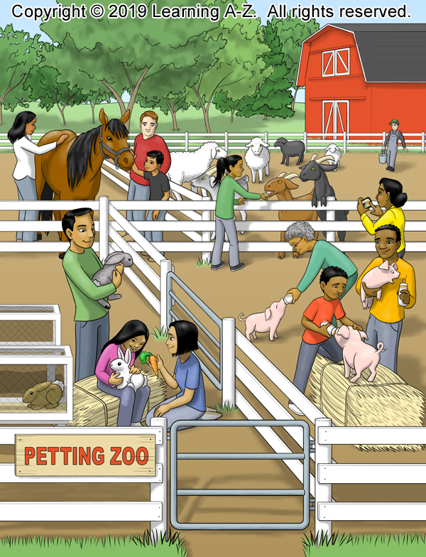
A second image for the Petting Zoo commission for Learning A-Z.

A second image for the Petting Zoo commission for Learning A-Z.

Here’s the first page of a Petting Zoo commission for Learning A-Z. I think the pigs were the most fun to draw. I managed to put at least one in each of the three images for this set. I particularly like the one reaching for the bottle on the right.

One more piece for Learning A-Z. A different view of the waiting room in a veterinarian’s office.

Here’s a recent piece for Learning A-Z. The waiting room in a veterinarian’s office. The unusual clientele is because this is for the educational market. The words for the animals (except for the cat) all have unusual plural forms. Wolf/wolves, sheep/sheep, goose/geese, mouse/mice.

Yesterday’s illustration was kind of scary. I think I was still thinking about the chain gang I did last week for stripes. So, I felt like I wanted to do something friendlier. So, here’s Litte Bo Peep.
“Shhh! She’ll never find us!”

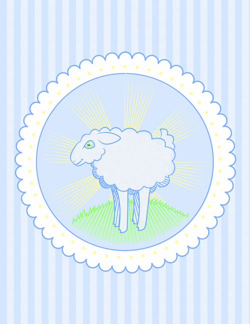
Okay, okay. Last post about the sheep. I promise. Here’s what I decided to go with. You might notice that I lengthened the legs? This way it looks more like a lamb than a sheep.

Buy it as a print or other product.
Here’s a pastel version of the sheep image I posted yesterday. I really liked playing with the hash marks all being the same direction as the lines on the rays of the sun. Technically, the sun’s behind the sheep. It should be back-lit. But that didn’t work so well with the hash marks. I may do a watercolor version with it backlit and see how that looks. But, anyhow, here’s today’s sheep.

And here’s a version without the radius lines.

Or make it really simple and remove the sun entirely. Then I don’t have the problem w/ the inconsistent light source.

Of course, it’s VERY pastel. Maybe bolder lines and a brighter green?
