
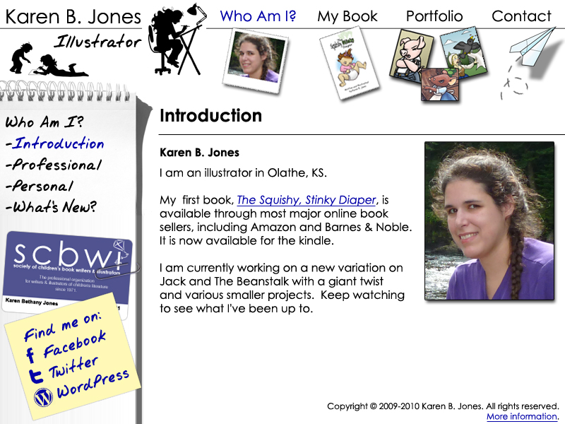
I’m redesigning my website. Here’s a mock-up of what it will look like. Click on the image for the full-sized version. Next I have to convert it into HTML, CSS Stylesheets, and PHP in order to implement it. 🙂
Tag: Olathe

Designing My New Logo
I’m designing a new logo for myself. I’ll print off business cards, promotional materials, and redesign my website around it sometime soon. But first, I needed the logo.
![]() This is what I came up with. I may still fiddle with it a bit, but that’s basically it.
This is what I came up with. I may still fiddle with it a bit, but that’s basically it.
I thought I’d post my sketches for this design, for anyone who’s interested in my process.

Here’s my first sketch.
This was my brainstorming sketch. I had an idea of what I wanted to do, but wasn’t quite sure how to accomplish it yet.
You can see the very first, rough attempt in the middle. Then a more detailed, refined sketch on the left. That was way too detailed for a logo, so I simplified that on the top right. Since the simplified version eliminated the little girl, I sketched out another idea with the girls on the floor drawing.

This one is almost the finished form. I wasn’t happy with one of the curls in the hair, though. So, I added a few curls to experiment with. You might note that the final version incorporated some of these curls.

This is very close to the final version of the girls. As you can see, I didn’t like the paper on the floor and made a couple of extra attempts at it.
Then I just played with positions and fonts to come up with the finished logo.
Sing a Song of Sixpence Illustrations – Version 3
 Way back in high school I had a Commercial Art project to illustrate a nursery rhyme. I chose to illustrate Sing a Song of Sixpence and it turned out really well. My teacher even went out of his way to compliment me on it, which didn’t generally happen because he was more of a fine arts sort of person. Cartoon work was beneath his notice.
Anyway, for several reasons that I won’t go into here, those illustrations never made it home with me and I always regretted losing them a little. So, about a year ago, I re-did them from memory. It wasn’t exactly the same work, of course. But I remembered the unique elements of layout and style that made that first version work so well.
 The new version was composed of two line drawing in black ink colored with colored pencils. I liked it really well when I first created it. However, as time went on, I liked it less and less. The line drawings were great. It was the coloring I didn’t like.
So, this week I redid the image once again. I had a version of the line drawings from before I colored them, so I opened up Photoshop and started from there. I just put the finished version up on my website. This version is the best one yet.
