
The next interior has two images, one on either side. Here’s the first one. Someone taking the team picture. This same picture is also used on the cover.
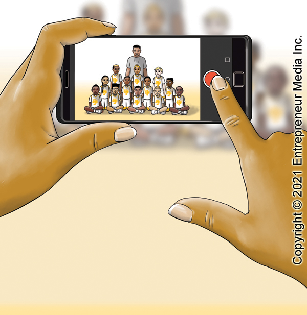
The next interior has two images, one on either side. Here’s the first one. Someone taking the team picture. This same picture is also used on the cover.
A wide view of the team’s first game for the picture book project I just finished. The text for this page fits in the white space over the bleachers on the left side. This image gives you a good view of the logo I designed for the Jackrabbits. This image took longer than you’d think because, even though the people are tiny figures there are 28 of them and most of them had to be drawn and colored consistently with the depictions of those same characters on other pages. Uniforms do save time on coloring, though.

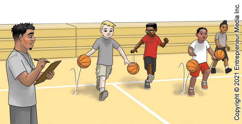
And another interior for Entrepreneur Media, Inc.’s picture book. This two-page spread only has a little bit of text, so there’s room for it in the white space over the bleachers. Coach miles is taking his new team through drills.
Here’s the next interior for Entrepreneur Media, Inc.’s picture book. Another two-page spread, with text to be overlaid on the blank spot to the upper left. The children are eagerly gathering around Coach Miles.

Here’s the next interior image of the picture book I just finished for Entrepreneur Media, Inc. This one’s a two-page spread, with text overlaid on the blank wall on the upper left. The children are excited about basketball tryouts!

Here’s the first interior page of the picture book I just finished for Entrepreneur Media, Inc. This image will have text overlaid over the sky and maybe the tops of the buildings. This is a nice spring day.

This week I finished illustrations for a new picture book for Entrepreneur Media Inc. Here’s a mock-up of the cover. The final text will be formatted a little different, probably a different font, but this gives you the idea.

A little behind-the-scenes detail: I originally had a different cover design concept in mind (below) but the client wanted this one (above) because they wanted to show everyone on both teams and didn’t want them to look aggressive.

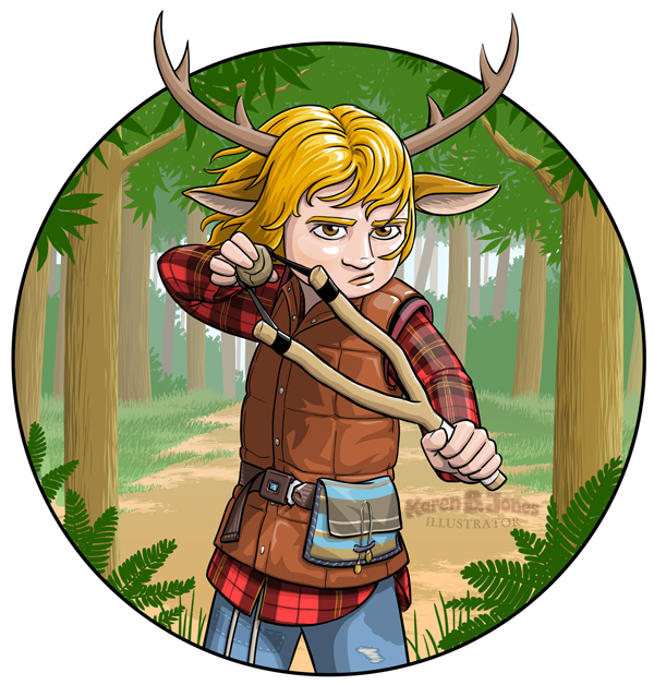
Here’s an illustration of the title character for the Netflix series Sweet Tooth.
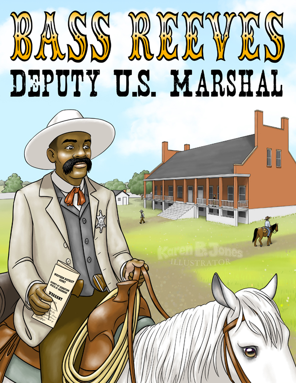
Here’s an illustration of Deputy US Marshal Bass Reeves riding out of Fort Smith, Arkansas with a warrant in hand. Bass Reeves was the first black Deputy US Marshal west of the Mississippi. He is thought to be the real-life inspiration for The Lone Ranger. He did not have an Indian sidekick named Tonto (which is offensive on a couple of levels) but he did have friends among the indigenous tribes living in the Oklahoma and Indian Territories. The story is that he fled to Oklahoma Territory after he learned about his emancipation from slavery after the Civil War. There he learned several native languages and how to shoot and track. Those skills and contacts, along with his own ingenuity, later helped him track down the outlaws he was charged with capturing as a Deputy US Marshal. Upon his retirement, he had over 3,000 arrests of felons on his record and had killed 14 outlaws, an impressive tally which inspired many stories.
I used some artistic license to give him a white horse, like The Lone Ranger, and the traditional white hat of the western hero. The Fort Smith courthouse is drawn how it looked sometime in the 1870s. I used several reference photos for both the courthouse and Bass Reeves himself.
The font I used on the bottom is named Nashville and designed by Disturbed Type. I like the eroded look to it. I hand drew the letters for his name using the font Tagwood by Intellecta Design as a guide.
Here’s the 6th illustration for the book project I just finished for Learning A-Z. Page 8 of The Neighborhood’s Night by Juliana Catherine.
Here Leena’s family makes it to the emergency shelter, which is the gymnasium at a school a safe distance from the wildfires. The important points of this illustration are to show the three families standing in line at the front, that they’re in a gym, and that there’s a crowd of people already there. Since I didn’t want the crowd to make the background too busy and distract from the foreground people, I made them fade from minimally colored at the front, to completely gray at the back. The color in the room also fades a bit as it recedes into the distance.
It was important to the client that I show diverse families, because they wanted to show that all sorts of people had been displaced by the wildfire. That’s why, in addition to Leena’s family, one family group consists of two women and a child and the other has a little grandmother and her grandkids, including one in in a wheelchair. The characters are a bit small to really show racial traits, but they do have a range of skin tones and hair color to indicate diversity. They also are diverse in the amount of stuff they managed to bring with them, either by affluence or by luck, it isn’t clear. One family group has several nice, big, rolling suitcases while Leena’s family just has some duffle bags and the third family doesn’t have any bags at all.

