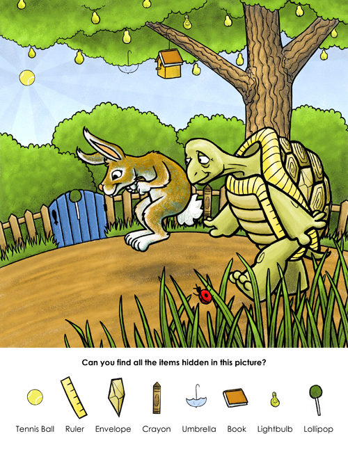
I recently had an opportunity through the SCBWI to have Paul Zelinsky critique one of my illustrations. This is the one I sent him:

This is what he said:
Hi Karen.
As a stand-alone piece you’d want this image to encapsulate as much of the hare and tortoise story as possible, or at least to bring life to a most dramatic part of it. Of course it’s also, in this case, first and foremost a repository for the hidden elements so it’s possible that what I just said may not matter that much after all.
The image is bright and colorful; it’s bold and has a certain clarity about it that is comforting for a child (as opposed to an image that is confusing or fussy). An art teacher where I was in graduate school used to tell his students (I was lucky enough not to be one of them) that you can’t make a picture that’s more than 30% green, the idea (I think) being that green is so dominant a presence that you have to limit it for esthetic reasons or it will just overwhelm. But you’re over 30% and it’s fine; I like the contrast between the particular green of the tortoise and the other green of everything else.?s a piece of art, there are a number of things that I would consider trying differently.
Characters: the two animals look a lot like familiar cartoon stylizations, especially the turtle; and this is personal to me, but I don’t care for these particular ways of making these particular animals, and I would go back to look at the real things to try to perhaps think of other ways to make those faces. Not that I’d make them any more realistic than you have, but there are other ways to stylize those heads. Hares may not be as round-faced as bunny rabbits, and compared to bunnies they do have long noses, but the top line of their head isn’t concave; there is always that corner where the brow is, which I think has a lot to do with the cuteness of rodent heads. Turtles and tortoises don’t have that ridge like a big hairband crossing their forehead, except they do in cartoons and I’m at a loss to know why. You have a right to keep these stylizations; it’s just that they won’t make me happy personally.
In your picture, the two characters don’t seem to me to show in their expressions what I would expect from the characters in the fable. I think of the hare as overconfident, and very fast, and tortoise as a plodding personality, not really competitive, and slow. I see your hare’s expression here as simply happy; he’s concentrating on the ground a little distance in front of him. With his paws drawn up under his chin, he looks like he’s making a gesture of delicacy, as if he’s taking tiny little hops. I don’t see anything in the pose or the way he’s drawn to indicate that he’s moving forward at a high rate of speed. Things that could indicate speed might include ears swept backwards, or legs extending far backwards from the hop, or maybe arms back behind him too, or one arm forward and one back—you could look at pictures of runners or long jumpers in the Olympics, as well as pictures of rabbits, for ideas.
To me the tortoise is not moving very slowly, and he’s looking at the hare with an ironic, slightly worried look. (I suppose this is the moment where the race has just begun). If the tortoise is a slow walker, wouldn’t he take smaller steps, and not have his leading leg stuck so far out? The gesture of his arms looks either like he’s swooping through space, or like something I am remembering from the movie La Cage Aux Folles, where the swishy gay partner can’t keep his hands from making this gesture as he practices a walk that is supposed to show how straight he is. The slowest way I can think of to show someone walking is on all fours. Did you consider that as a possibility?
However, for the purposes of this picture, it’s quite possible that none of what I’ve said matters. It would certainly matter if there were a story being illustrated, but not if your real need is just a well-drawn and interesting picture in which to hide all of those hidden bits.
And for that purpose, there is really one thing I would strongly recommend: be more aware of how your shapes intersect, overlap, or touch. Overlapping is probably the prime way that pictures establish a space—what’s in front and what’s behind. When things don’t overlap your eye looks for other clues to establish a space. But when they just graze each other, or when they line up, that’s when they become one with each other, and this is happening in your drawing where it shouldn’t. Hare’s nose and the edge of the gate, Tortoise’s nose and Hare’s back, Tortoise’s right hand and the edge of the road, Hare’s front ear and the edge of the bush—these things would all be easy to fix with a little moving around, and the picture would be much the better for it. That blue gate, for instance, could badly use something in front of it because it’s quite a dominant shape and capping off the curve of the road as it does, it takes center stage without having a reason to.
The grass in front looks very nice. It uses a combination of thick and thin lines in a more-elegant way that I think might go well in other parts of the drawing, particularly in Tortoise. Too many outlines that are too thick make a drawing look like a coloring book, and interspersing different thicknesses of line keep that from happening. If you can extend the feeling of the grass to the rest of the drawing, and work on those overlaps, I think it would be greatly improved.
After thinking about his advice for awhile, I made changes to the illustration and came up with this:

I added three hidden objects, changed one hidden object, completely re-did the hare’s face, changed arm position on the hare, changed the tortoise’s head slightly, gave the tortoise a walking stick, changed the arrangement of the grass and ladybug in the front, and added some flower bushes. A few other things, too, but those are the major changes. I like it better now. What do you think?
It is my firm belief that constructive criticism of this kind is the most valuable sort of feedback one can get. Everyone gets polite or friendly compliments on their work, but the ones that say this is wrong and this is why are the rarest and most appreciated.
A variation of this image is available through shutterstock here.


