

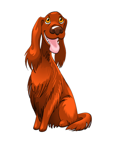


This might be my Christmas card design this year.
Or does it look better with more painterly colors?

I made some cards and things with this design.

Thank you, Penelope with Illustration Friday, for choosing my prompt again this week.
I used a font called ROCKY AOE by Astigmatic One Eye Typographic Institute. The rest of the image is entirely my own work.
 It’s kind of sketchy and I think the arms look weird. Not worthy of the portfolio, but it’s still fun and refreshing. 🙂


I think this is the final version. I’ll need to double-check the colors on my other computer, but it’s getting late tonight. I’ll just post it as-is. If the colors look a bit too bright, blame it on my laptop. I’ll make adjustments tomorrow if it needs it.
The font is a distorted, gradient-overlaid, embossed version of Komika Boo, by Larry Yerkes. That’s a free font I got from some free font site. I’d put a link to the author’s Myspace site, but I looked at it and, YIKES. Not linking directly to that. But feel free to put his name into Google and find him if you want. He goes by WolfBainX.
Anyhow, here’s the image:


