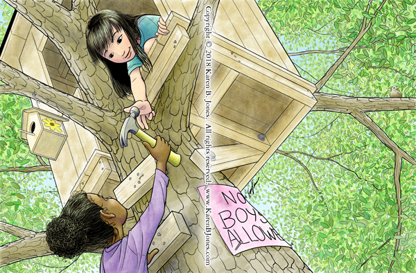
Here’s the completed image. It was designed as a full spread. That means nothing important in the way of the center fold. Also, not much is happening on that right side because it would have a fade over most of that half with text overlaid.

Here’s the completed image. It was designed as a full spread. That means nothing important in the way of the center fold. Also, not much is happening on that right side because it would have a fade over most of that half with text overlaid.

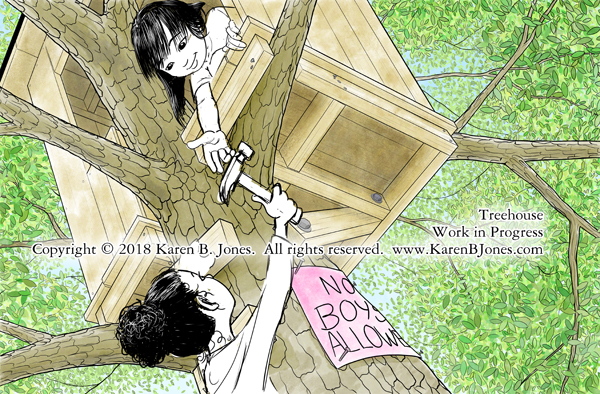
Here’s the scene with a few more leaves and the characters roughed in. I’ll adjust the placement a bit and work on the proportions a little. Need to figure out how to do the folds on the lower girl’s shirt. Then comes final lines and coloring. 

Here’s the finished version of an illustration for Hart Mcleod.

The original discription wanted a poet breaking up and reattaching words to make new words. Specifically January + August = Januaugust and October + September = Octember. Several suggestions on how to do this were given, including making the words into logs that are being cut apart with a saw and nailed together with a hammer.
I chose this interpretation because two poets allowed me to show both the sawing and nailing in one image instead of two panels. It showed that both boys and girls can be poets. It showed a girl using a hand tool, which is always a good thing in my view. They’re beatniks because it’s about the closest thing to a poet’s uniform I could think of. If they’d been older, I would have given the boy the stereotypical beatnik goatee, but I wanted them to be kids, so I couldn’t.
The colors came from the sample layout that went along with the assignment. Not exactly the colors I’d have chosen, but they should go well with the final pages. I haven’t run a test print yet, so the colors may be off a bit.
I think it turned out pretty well. This is the most complex of the images in this project.