

Inktober #7
So… I was trying zombies again. This time I was going for cute. Not sure if zombies can actually be cute. But the girl does look happy, at least.
Inktober #7
So… I was trying zombies again. This time I was going for cute. Not sure if zombies can actually be cute. But the girl does look happy, at least.

Inktober #6.
I think maybe this ghost isn’t quite as scary as it thinks it is.

Inktober #5
This one’s a lot ickier than I usually draw. But it’s a zombie. They’re inherently pretty icky. I think I’ll have to do something cute for tomorrow to wash the zombie stink off my stylus.

Inktober #4

Inktober #3.
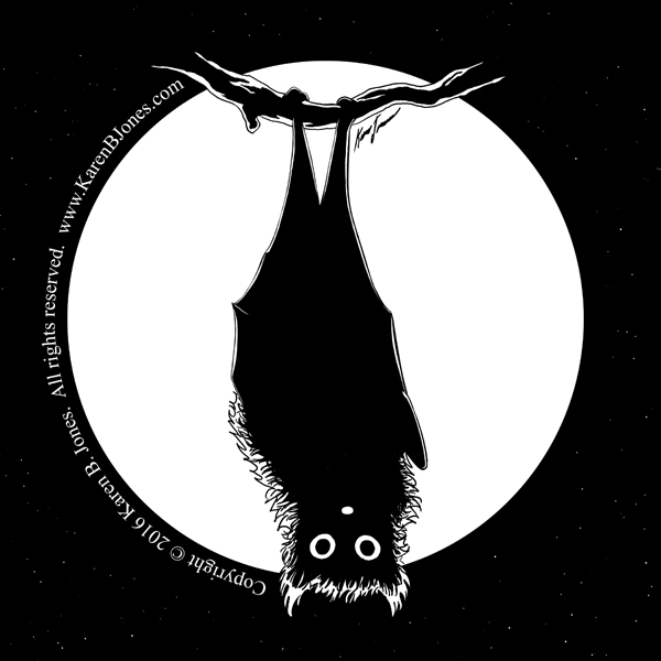
Here’s a bat for Inktober #2.

Thank you, Penelope with Illustration Friday, for choosing my prompt again this week.
I used a font called ROCKY AOE by Astigmatic One Eye Typographic Institute. The rest of the image is entirely my own work.
 We decided to be creative with our pumpkins this year. The girls thought it was SO funny. 🙂
I updated this because it kind of bugged me that it was hard to read. All fixed now. 🙂

I think this is the final version. I’ll put it aside for a week and then come back to it once the “Look at the masterpiece I just created!” buzz has faded. Then I should be able to judge it more objectively and see if anything needs to be changed.
In the meantime, there’s nothing to keep all of you from commenting. What do you think? Is there anything that I need to change about this? I haven’t double-checked the colors on my other monitor. Do they look okay or are they too bright? Does anything look awkward? The wrong color? Incorrect shadows? If you notice anything, pleas let me know. It’s digital, so I can still change quite a lot if necessary.

MAGIC for Fun and Profit
