We’ve been ice skating a lot this year, so I drew this.

Get it from shutterstock here.
We’ve been ice skating a lot this year, so I drew this.
Get it from shutterstock here.
I’m not entirely happy with the composition. It feels sort of unbalanced, somehow, no matter how I crop it… Dunno. I may need to work on it some more. *shrug*
I really like the colors and the way I drew the guy, though.
Here’s an image illustrating some instructions on how to make a pop-up greeting card. Created for Hart McLeod for a third grade textbook.


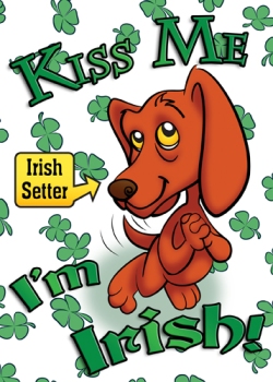
I wasn’t entirely happy with the last one. I like this one better. It’s meant to be the cover on a greeting card. Next up: The interior spread! 🙂
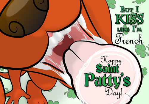
I certainly hope the CS6 version of Illustrator is much better with fonts than the old version I got a hold of. As it is, I’m using Photoshop CS5 for the text, and Illustrator CS2 for the vector graphics. It IS better with vectors than the quasi-vector tool (paths) that Photoshop has, though. So, that’s something. I’m also learning how best to use each for different parts of the image. I may break down and buy the new version of Illustrator, but only if I start doing enough vector work for it to be worthwhile. In the meantime, I’m just using it as a learning experience.

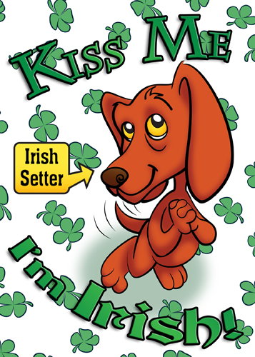
And here’s a variation for a Thank You card.