Red Rose


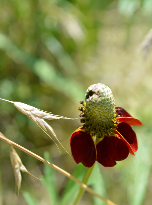
I think this is some sort of cone flower.


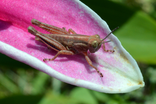
A cricket (or maybe it’s a grasshopper) on the petal of a pink Asiatic Lilly.


Open in Photoshop. Auto contrast, auto color, auto tone–hey, that’s weird. The auto tone made the blossoms look great, but the background look blue. So, then I masked out the blossom and used the auto tone on that, but only used the auto contrast and auto color on the background, with just a hint of desaturation.
I love daffodils. They’re my favorite flower, even though generally I’m not a huge fan of yellow. But on daffodils, I make an exception. I’m usually disappointed in my attempts at daffodil photography (they never seem to want to face the camera the right way) but I think I like this shot. It looks cheerful, like a daffodil should. 🙂
Here’s a commission I just sent in to Hart McLeod.
Hidden in the image are 12 pictures. They weren’t supposed to be TOO hard to find, so you should be able to spot them. A woman, a man, two girls, one boy, one owl, two rabbits, three turtles, and a frog.
Interesting thing about this project. They told me which hidden elements they wanted to see, but said that the scene was the artist’s choice. I hate that. That means I had to figure out an interesting scene and compose it with no guidance or limits. I love limits. Contrary to what you’d think, I can be so much more creative if I have defined framework to work in. Oh well.

Luckily, I pulled out this reference photo from my photo collection and used it as my framework. I took this at the Overland Park Arboretum this fall. There actually is a pond off the frame to the left, but it isn’t to the horizon like in the drawing.