
I think this is going to be my holiday card image this year.

I think this is going to be my holiday card image this year.
And now I’m done. Same character from about age 2 to 18.
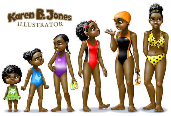
Five ages now. I think at 16 she might just be on the swim team.
A series of character sketches depicting one character through multiple ages.
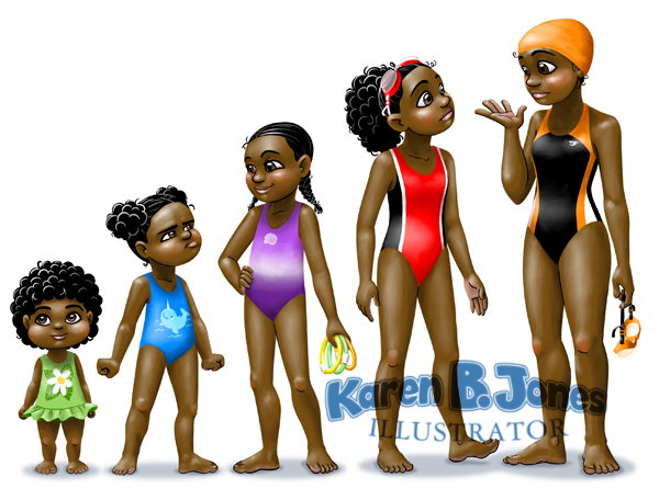
Now 4 ages. I bet she’s a good swimmer by age 13.
A series of character sketches depicting one character through multiple ages.
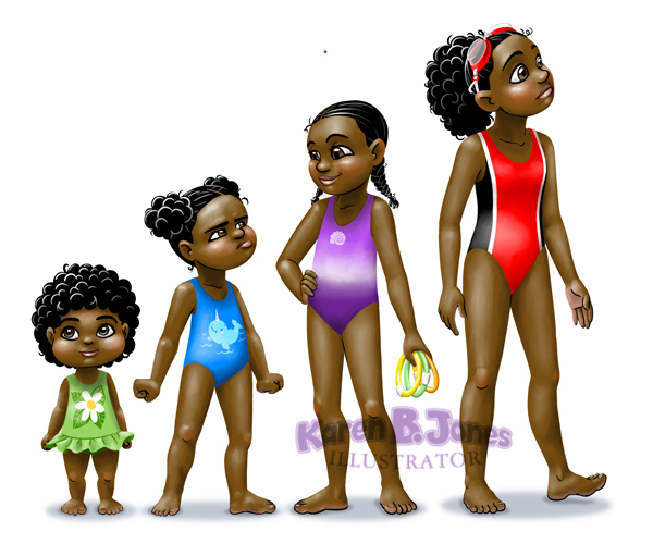
Here’s the same girl at ages 2, 5, and 10. Or thereabouts, anyway.

Here’s the same girl at ages 2 and 5.

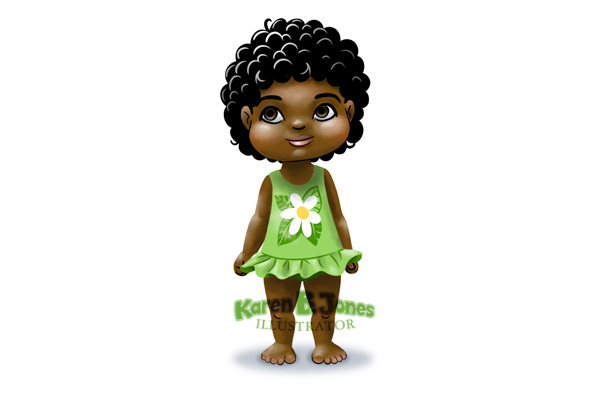
Here’s a cute 2 year old in a little skirted swimsuit.

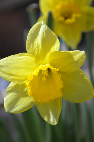
Open in Photoshop. Auto contrast, auto color, auto tone–hey, that’s weird. The auto tone made the blossoms look great, but the background look blue. So, then I masked out the blossom and used the auto tone on that, but only used the auto contrast and auto color on the background, with just a hint of desaturation.
I love daffodils. They’re my favorite flower, even though generally I’m not a huge fan of yellow. But on daffodils, I make an exception. I’m usually disappointed in my attempts at daffodil photography (they never seem to want to face the camera the right way) but I think I like this shot. It looks cheerful, like a daffodil should. 🙂
