I added some swirls and magic sparkles to this one I did awhile ago. I think this looks better. And it hides the fact that I didn’t really bother to include an actual background. Just a color.
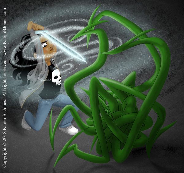
I added some swirls and magic sparkles to this one I did awhile ago. I think this looks better. And it hides the fact that I didn’t really bother to include an actual background. Just a color.
A helpful air traffic controller commissioned by Kyle Szklenski of Diurnal Productions. His company is a small video game company and this is for any scene where the player is talking with air traffic control. It’s a digital image drawn in Photoshop. There are a couple gradients, but mostly it’s flat colors with cel shading.

A slightly sleazy businessman commissioned by Kyle Szklenski of Diurnal Productions. His company is a small video game company and this is for a scene where the player signs with their new employer. It’s a digital image drawn in Photoshop. There are a couple gradients, but mostly it’s flat colors with cel shading.

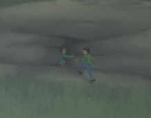
Here’s a girl with a glowing (probably magic) sword fighting some sort of tentacle monster.
It maybe needs some magic sparkles or swirls, but I’m happy with it for now. I may add a few more magic effects later. I dunno. I’ll think about it.

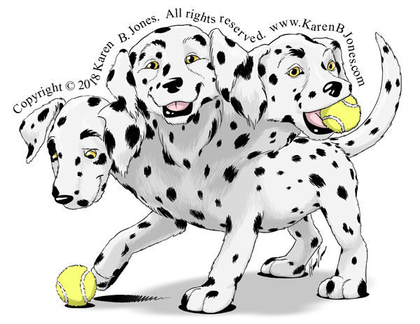
So, this was originally a Inktober piece and was done in just a couple of hours. I drew him as a black lab puppy. But, that decision has bugged me because Cerberus is supposed to mean spotted. Which I knew, but didn’t think of it at the time. I really should have made him a dalmatian or other spotted breed. So, today I had reason to go back to this image and so, while I was there, I decided to fix it.
So, here’s Cerberus, the spotted three-headed hound of Hades.

And here is the final version of the piece I’ve been working on! So much excitement going on here. You’ve got the rockets blasting off behind, probably an emergency evacuation. Are the searchlights searching for her, specifically? You have the abandoned motorcycle, maybe it was hers and it ran out of gas or something? That would explain the goggles. Looks like she must have met with an accident on her right side at some point in the past because she’s got a prosthetic arm and leg. They must be good tech, though, since they don’t seem to be slowing her down any. Notice the blue light on her arm? That’s a power indicator. She still has a full charge. It’ll turn orange, then red as it runs dead. At which point she becomes a lefty. I’m not sure what the earpiece is. Maybe just communications equipment, maybe a hearing aid of some sort? It is on her injured side. What’s in her bag do you think? Tools for maintaining her prosthetics? Or the plans to the enemy’s base that she has to deliver into rebel hands? It doesn’t look like she has any offensive weapons. Just that energy shield, but I think it’s underpowered to stop that robot hand. Maybe it will buy her a crucial second to slip out of its grip, though!
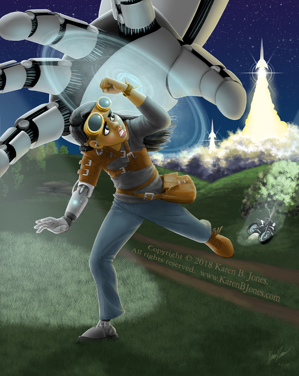
Here’s an Easter egg. You can’t tell at the resolution above, but this is in the background. The search light washes it out, but you can see that she’s not the only one running.
And here’s a behind-the-scenes from way back when I first started this piece. This little mannequin helped me work out her pose.

This piece was a personal project, not one meant for any particular client. I wanted to add a detailed sci-fi piece in my portfolio, one with a lot of action. So, that’s the reason for it. I’ll get it up on the portfolio in a couple of days here. [Edit: It’s up now.]
I had not really intended it to be as involved as it ended up, but the concept demanded certain elements and complex lighting. Luckily, since I had no real deadline, I was free to take as long as I liked. It was fun and I really like how it turned out. 
I got my newest promo postcards from VistaPrint just now.
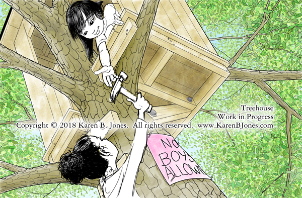
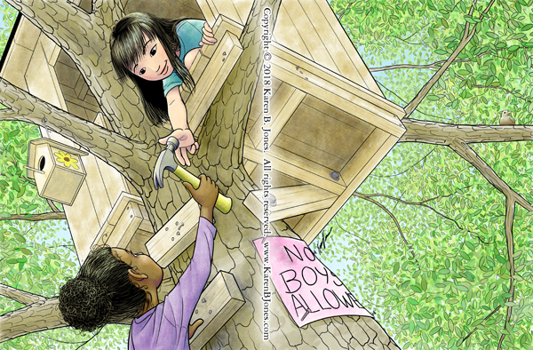
It’s a girl-themed card this time. I used the new Girls in a Treehouse image on the color side and the one with Sarah and Katie with the bike and skateboard on the back side. You might notice that I recolored the “No Boys Allowed” sign so that it didn’t distract from the overlaid text. You probably didn’t notice (because it’s not important) but I moved the bird too. The image wasn’t exactly the same dimensions as the card, so I had to cut off a little at the sides. So, I nudged the bird over a bit so it wouldn’t be too close to the edge. Working with digital images makes last-minute changes so much easier!
Now, I really need to get moving on my promo mailing list. I’m in the process of transferring my notecard-based system into a computer-based one. I have to type everything in new, which is time consuming now but should pay off later.
Anyone want one of these postcards? Contact me with your name and address and I’ll mail you one.

Here’s the completed image. It was designed as a full spread. That means nothing important in the way of the center fold. Also, not much is happening on that right side because it would have a fade over most of that half with text overlaid.
Here’s the scene with a few more leaves and the characters roughed in. I’ll adjust the placement a bit and work on the proportions a little. Need to figure out how to do the folds on the lower girl’s shirt. Then comes final lines and coloring.