

Inktober #7
So… I was trying zombies again. This time I was going for cute. Not sure if zombies can actually be cute. But the girl does look happy, at least.
Inktober #7
So… I was trying zombies again. This time I was going for cute. Not sure if zombies can actually be cute. But the girl does look happy, at least.
Here are my girls playing in the street.

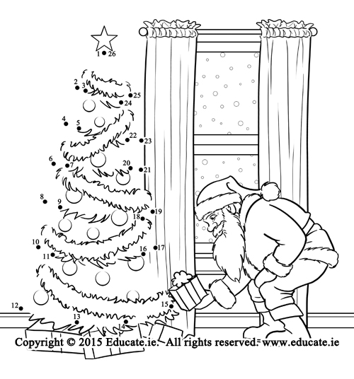
Here’s the last set of Christmas line drawings I did for educate.ie, an Irish educational publisher.


I sketched this today. I was playing with expressions. I wonder what they’re so nervous about.

Here’s an illustration of mine that’s in the November issue of 435 Magazine.
Here’s the finished version of an illustration for Hart Mcleod.

The original discription wanted a poet breaking up and reattaching words to make new words. Specifically January + August = Januaugust and October + September = Octember. Several suggestions on how to do this were given, including making the words into logs that are being cut apart with a saw and nailed together with a hammer.
I chose this interpretation because two poets allowed me to show both the sawing and nailing in one image instead of two panels. It showed that both boys and girls can be poets. It showed a girl using a hand tool, which is always a good thing in my view. They’re beatniks because it’s about the closest thing to a poet’s uniform I could think of. If they’d been older, I would have given the boy the stereotypical beatnik goatee, but I wanted them to be kids, so I couldn’t.
The colors came from the sample layout that went along with the assignment. Not exactly the colors I’d have chosen, but they should go well with the final pages. I haven’t run a test print yet, so the colors may be off a bit.
I think it turned out pretty well. This is the most complex of the images in this project.
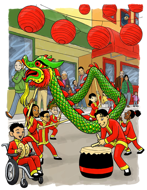
I drew this as a sample for my art rep. It’s supposed to be a class, led by a male teacher, performing the traditional Chinese dragon dance at a community Chinese New Year celebration. The teacher is on drums, Steven (the narrator) is on cymbals, a girl holds the dragon’s head, and four other students hold the body of the dragon. Genders should be balanced. The class should be mostly Asian, but with two non-Asian characters. The students live in a non-Asian country. It’s for an international market, so the usual restrictions as to gestures and girl’s dress apply. Showing children with glasses or disabilities is encouraged.
Chinese New Year is in February, so I figured it was a chilly day. The sort of weather where some people wear their heavy coats and others stick it out with a jacket or heavy sweatshirt.
There were no specifics on Kevin. So, I made him sit in a wheelchair. It gave him a reason to be out in front and the seated position worked better for placing everything, I thought.
I know next to nothing about Chinese New Year traditions. Or the dragon dance. Everything here used references from a Google image search. Does anyone reading this know anything about this subject? Have I drawn anything that stands out as obviously wrong?
How do the colors look? Anything too bright? Does the background overwhelm the foreground?
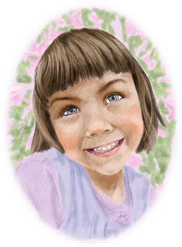
I realized I’ve never posted any realistic portraits of people to this blog. So, I created this just to show I can. It’s a portrait of my daughter Katie. It’s drawn in Photoshop using a photo I took a few weeks ago as reference. This is an actual digital drawing, not a Photoshop filter trick.
It also counts for this week’s Illustration Friday prompt of Children. Well, child, anyway.
This week’s Illustration Friday prompt was jump. I was going to just repost my lovely swimmer children. But, then I decided to do a little more. For those of you who saw the work in progress sketches for these two, you might remember that these were not created for the same scene. But I decided to change that and combine them into one scene formatted for a magazine cover. So, I added a background and mocked up graphics for a Highlights Magazine. So, here’s the plain image and the Highlights mock-up below. Let me know what you think. 

I am not in any way affiliated with Highlights Magazine and this is not a real Highlights cover. Only an art sample.

