
Here’s an illustration I completed a few days ago for Paul Maguire’s book The Genie Loophole.
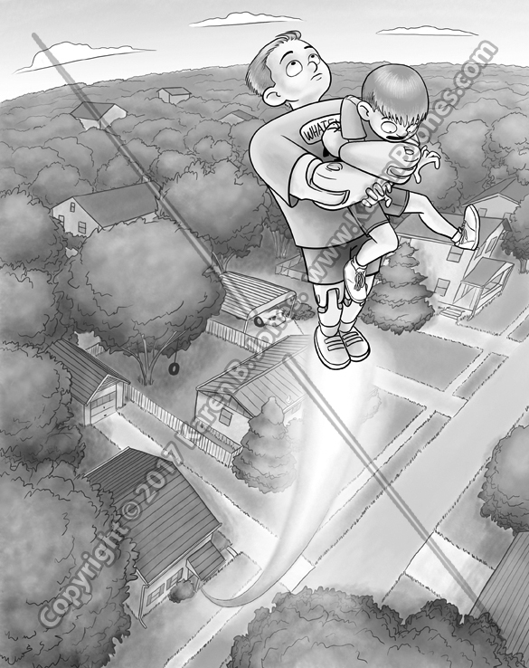
Here’s an illustration I completed a few days ago for Paul Maguire’s book The Genie Loophole.
My third kite-themed entry for the SCBWI Postcard Illustration Contest.
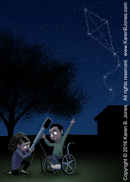
My second kite-themed entry for the SCBWI Postcard Illustration Contest.

A delighted boy is carried aloft by his kite while his mother chases behind in a panic.

Inktober #29
Here you go. Something nice and wholesome. 🙂

Inktober #15
I’m sure he deserved it.

Inktober #6.
I think maybe this ghost isn’t quite as scary as it thinks it is.
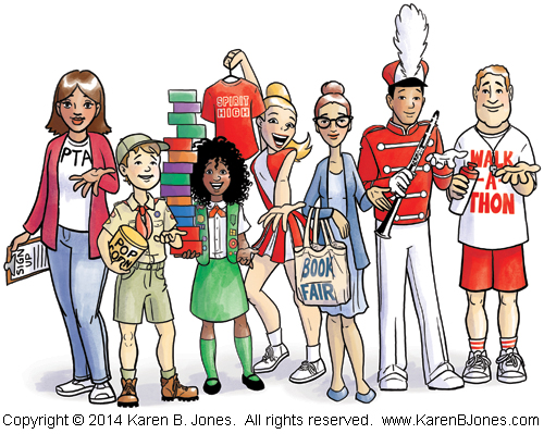
Here’s an illustration of mine that’s in the November issue of 435 Magazine.
 I was asked to revise this to make both characters non-white so as to increase the diversity of the illustrations in the textbook. I left the girl as she was, since she was already brown-skinned. The boy became black with dreadlocks. (Because dreadlocks are fun to draw.)
Here’s the finished version of an illustration for Hart Mcleod.

The original discription wanted a poet breaking up and reattaching words to make new words. Specifically January + August = Januaugust and October + September = Octember. Several suggestions on how to do this were given, including making the words into logs that are being cut apart with a saw and nailed together with a hammer.
I chose this interpretation because two poets allowed me to show both the sawing and nailing in one image instead of two panels. It showed that both boys and girls can be poets. It showed a girl using a hand tool, which is always a good thing in my view. They’re beatniks because it’s about the closest thing to a poet’s uniform I could think of. If they’d been older, I would have given the boy the stereotypical beatnik goatee, but I wanted them to be kids, so I couldn’t.
The colors came from the sample layout that went along with the assignment. Not exactly the colors I’d have chosen, but they should go well with the final pages. I haven’t run a test print yet, so the colors may be off a bit.
I think it turned out pretty well. This is the most complex of the images in this project.
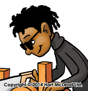
 Just a little sketchy guy drawn in Photoshop to look like marker on grey paper. Digital markers, but real grey paper. I scanned a sheet of grey Canson pastel paper to get this nice texture.
