Here’s the completed image. It was designed as a full spread. That means nothing important in the way of the center fold. Also, not much is happening on that right side because it would have a fade over most of that half with text overlaid.
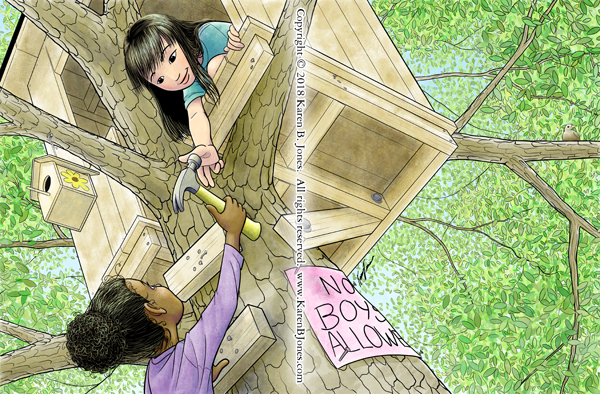
Here’s the completed image. It was designed as a full spread. That means nothing important in the way of the center fold. Also, not much is happening on that right side because it would have a fade over most of that half with text overlaid.

I put my black cat drawing on a Zazzle T-shirt. Get it here.
The fourth and final kite-themed image for the SCBWI Postcard Illustration Contest.
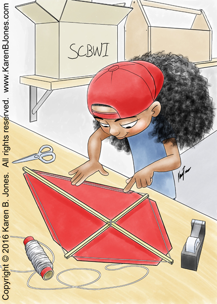
My third kite-themed entry for the SCBWI Postcard Illustration Contest.
So, I received my copy of the SCBWI Bulletin in the mail yesterday and I found out which of my images they picked to publish. Turns out it’s Boy Reading, an image I sent them in May of 2012. Yay! So, when they say they hang onto artwork to use later, they really aren’t kidding! 


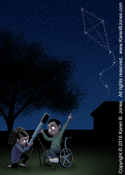
 I was asked to revise this to make both characters non-white so as to increase the diversity of the illustrations in the textbook. I left the girl as she was, since she was already brown-skinned. The boy became black with dreadlocks. (Because dreadlocks are fun to draw.)

Here’s the same image as a night scene with the aurora borealis.

I added some downloadable paper and cardboard textures to my freebies section. Enjoy.

The double heart is mine. The font is Action Man, which isn’t mine.
Another good variation would be to use the word “forever”, with the “o” being the double heart.