Let’s Talk Styles

I like to experiment with how I draw. As a result, I’ve been told that my collection of work looks like it could have been done by several different artists. This can be a problem because it raises the entirely valid question of whether I’d be capable of maintaining one consistent style through an entire book project.
However, I have completed 11 book projects and many smaller image series while maintaining internal style consistency for each one.
I believe that my range of styles allows me the versatility to take on many different types of projects within the children’s market and beyond.
Most of the differences in my style come down to three elements. Character proportions, line style, and coloring style. Mix and match those and you’ll get quite a varied range of looks.
Character Proportions
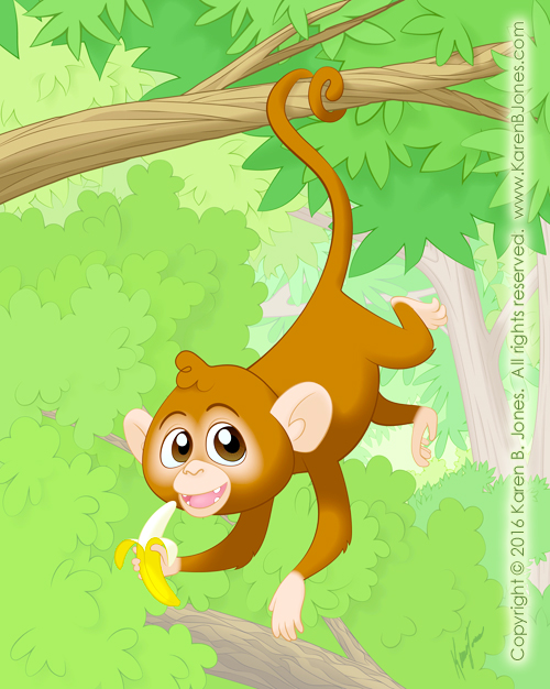
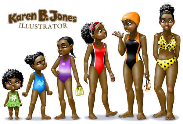
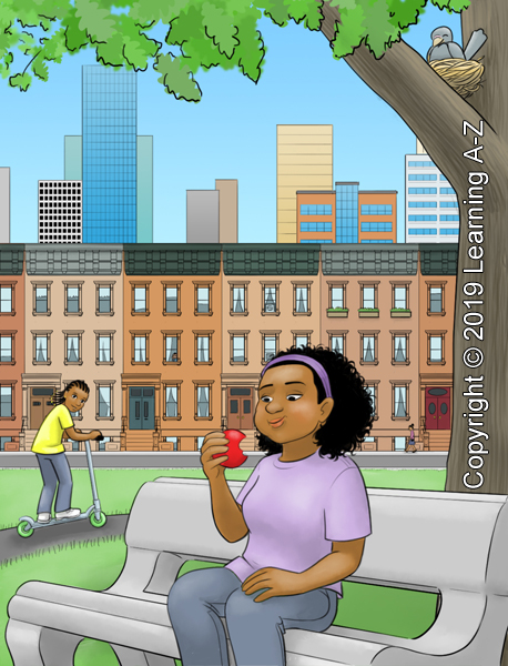
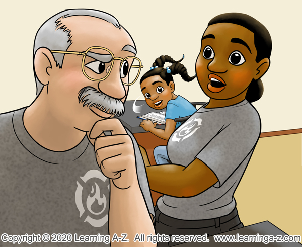
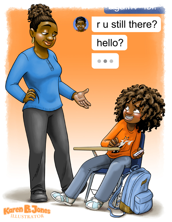
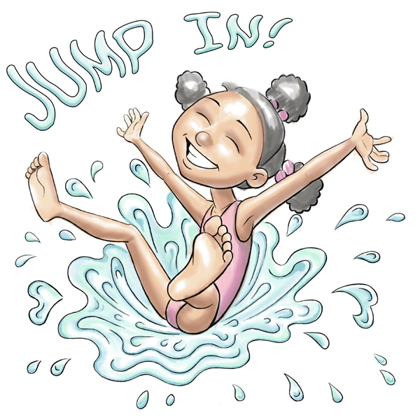
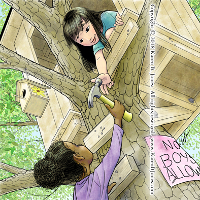
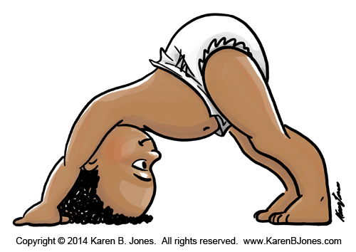
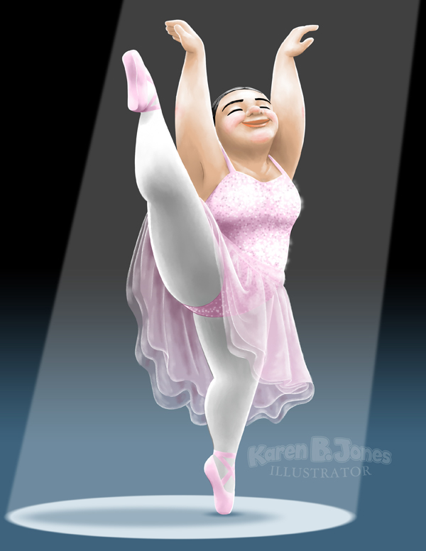
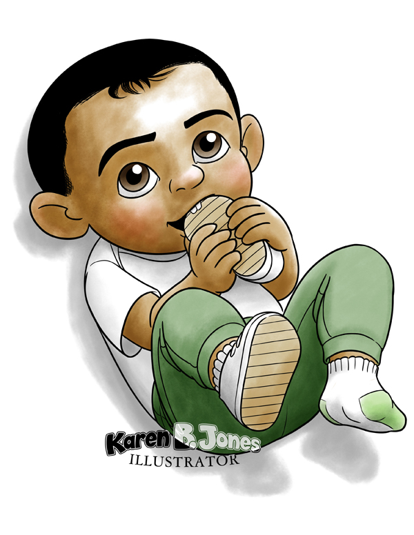
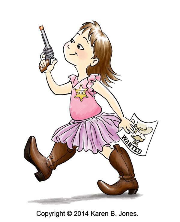
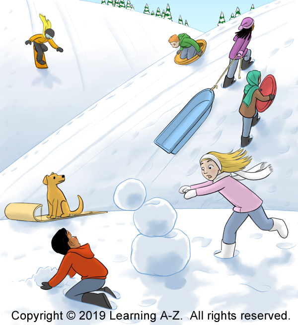
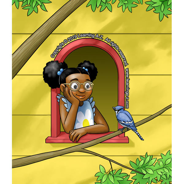
Most of the time I draw characters with more-or-less these proportions. I think of it as semi-realistic cartoon proportions. In this style, heads are a little oversized, eyes are usually extra large, and baby characters have the most exaggerated features.


However, since I do experiment, I have played with doing styles with more cartoony design. I can do chibi proportions and other larger-headed cartoon characters.


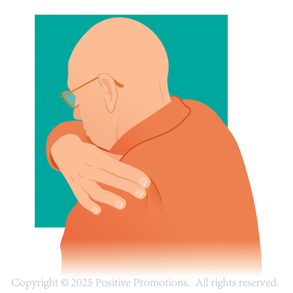
I can also do cartoons with more realistic facial structures.
Line Style
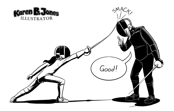
Line style also contributes significantly to the look of the piece. When I first started out with illustration, I was working on paper and I had some brush pens that I really liked. They produced very thick, heavy lines. I still like heavy lines sometimes, but I haven’t found much demand for it. This style tends to be the fastest to draw, but can’t handle much detail. It would be good for simple picture books or comic strips.


Lately, I’ve been playing with a lineless or limited lines style. Unless it’s a really simple drawing (like that fox and panda up above) these typically take the longest because they’re the closest I generally come to realistic details and lighting. This is my favorite style to work in if I have the time to devote to it.

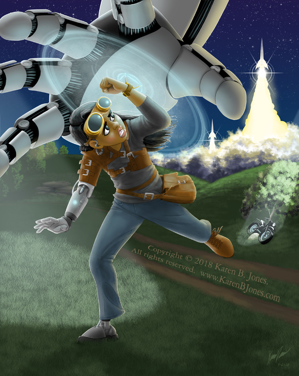

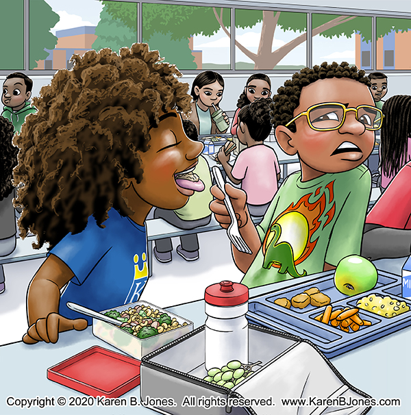
Since I don’t usually have all the time I might want, most of my work uses medium weight, black lines. It allows me to fit in more detail than the heavy line style, but without having to spend too much time considering the lighting like with the limited lines style. In this one, the lighting doesn’t actually matter much until after I finish the lines and start on the colors. Which saves time.


Colors, Shading, and Highlights
There are two fundamental approaches to color that I use on my illustrations.
The first approach is like using watercolor paints or art markers. I choose a digital brush that applies a semi-transparent color that builds on itself with each stroke. Also, usually, with a bit of texture. I leave the hilighted areas white or mostly white and build up the color where the shadows need to be. If necessary, I’ll add a bit of white or black at the end, but the values are mostly a matter of how much color I build up in each area. It’s a nice soft look that would be good for a picture book.

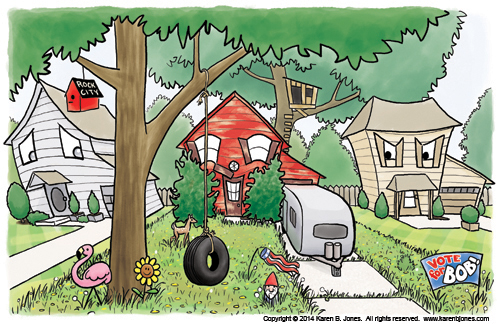

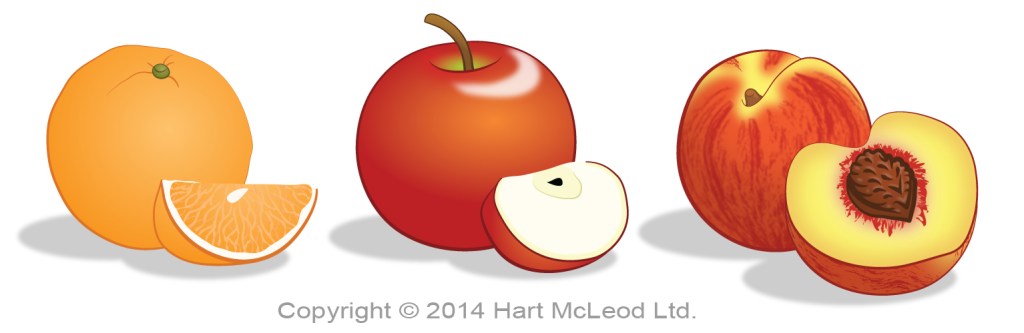
The other approach, and the one I use most often, is more like using opaque paints. I apply a solid, uniform base color to each colored area of the image. Very rarely, I will leave the image with just these base colors. Like this scene, a tiny spot included in a larger coloring book cover completed on a tight deadline.

Usually I won’t leave it flat like that, though. It tends to look unfinished to me.
Instead, I add semi-transparent shadows and highlights on top of the base colors. If I leave them sharp-edged, that’s called cel shading and is often used when the illustrator has to draw a large number of images quickly, like with some types of comic books or graphic novels. It’s also known as toon shading because hand-drawn animated cartoons often used this technique. It’s often a quick and simple technique, but it can also be used in more detailed work.


Usually I blend the edges of my shadows and highlights with a bit of texture. It can look almost the same as the marker-like technique. Or it can look significantly more complex, if I add more complicated color overlays.

Two More Things
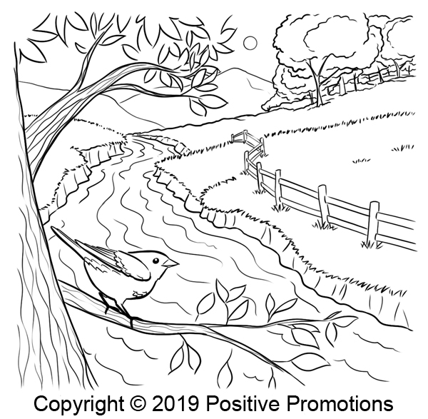
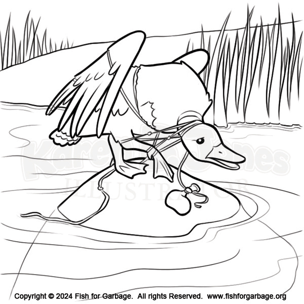
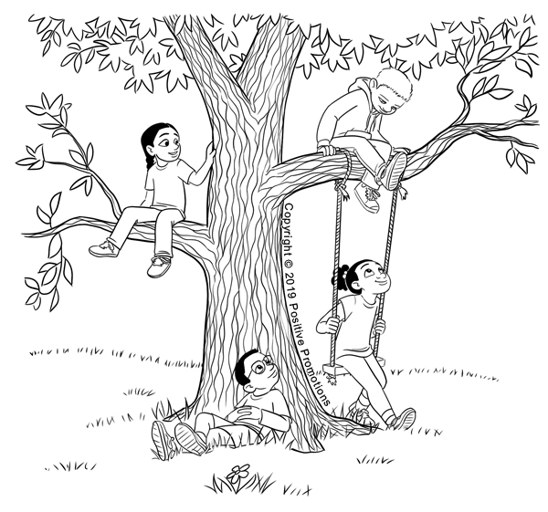
I can do line drawings or black and white with various types of shading. These are good for activity books, interiors for illustrated chapter books, and magazines with limited budgets for color printing.


I can also do vector graphics in Adobe Illustrator.