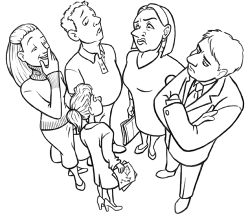
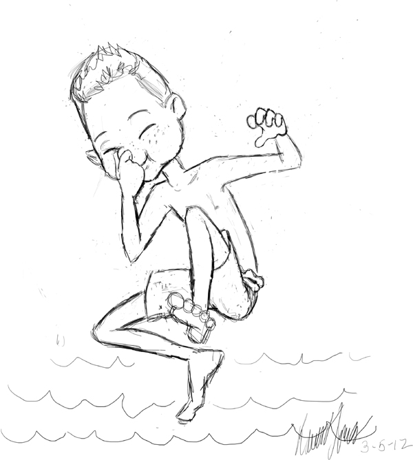
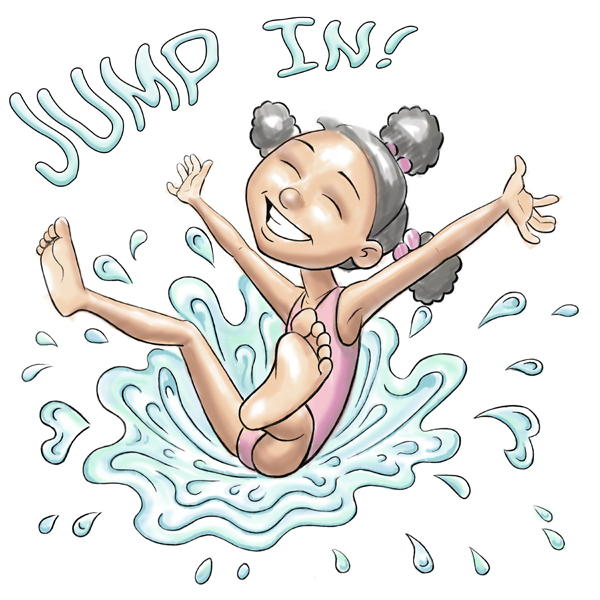
Yes, I’m still working on this one. The crowd scene is boring to draw, so I’m dragging my feet. But I thought I’d share this. This is the same character as an adult and as a child.


Yes, I’m still working on this one. The crowd scene is boring to draw, so I’m dragging my feet. But I thought I’d share this. This is the same character as an adult and as a child.


And here you have the lineart for about half the final image…

A couple of bits from a piece I’m working on called Perception.


I haven’t done anything really cute in awhile. So, here. What’s cuter than kittens in a basket?


I think this is the final version. I’ll put it aside for a week and then come back to it once the “Look at the masterpiece I just created!” buzz has faded. Then I should be able to judge it more objectively and see if anything needs to be changed.
In the meantime, there’s nothing to keep all of you from commenting. What do you think? Is there anything that I need to change about this? I haven’t double-checked the colors on my other monitor. Do they look okay or are they too bright? Does anything look awkward? The wrong color? Incorrect shadows? If you notice anything, pleas let me know. It’s digital, so I can still change quite a lot if necessary.

MAGIC for Fun and Profit


I think this is the final version. I’ll need to double-check the colors on my other computer, but it’s getting late tonight. I’ll just post it as-is. If the colors look a bit too bright, blame it on my laptop. I’ll make adjustments tomorrow if it needs it.
The font is a distorted, gradient-overlaid, embossed version of Komika Boo, by Larry Yerkes. That’s a free font I got from some free font site. I’d put a link to the author’s Myspace site, but I looked at it and, YIKES. Not linking directly to that. But feel free to put his name into Google and find him if you want. He goes by WolfBainX.
Anyhow, here’s the image:
