Downward Dog Baby (Yoga)
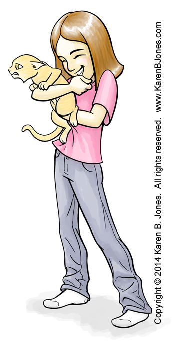
Just a sketch.


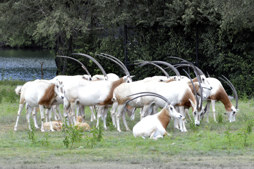 Look at those horns!
Like many things, this was a more impressive shot in person. all those horns all going the same way arching over the little herd… I dunno. But in the photo, the background detracts, so I desaturated it. Then there’s how brown and white aren’t really colors that pop and it looks silly if I bump them up too much. Oh, well. At least their horns stand out from the trees so you can see them well.
Here’s a spot illustration I did for the August issue of 435 Magazine. It was for an article about the new Verrückt water slide at the Schlitterbahn water park. The slide’s billed as the world’s tallest waterslide and the name means insane. They had to do a lot of testing and redesigning before they FINALLY got it so it worked right and could open it.
Unfortunately my illustration didn’t end up running. The bit in the article that mentioned this slide was cut. So, they didn’t need the illustration.

Just as well, because there are some problems with this illustration. It was drawn when they were still testing the slide and it wasn’t opened yet. When it opened, the rafts were different than all the reference materials I could find showed them. Originally, the rafts were supposed to hold four people, have lower seat backs, and lap belts only. The rafts they had when it opened had shoulder belts, higher backs, and only held three people. So… *sigh* it didn’t turn out as accurate as I wanted it.
Since it’s digital, it’ll be pretty easy to change, though. Just take out the derpy guy at the back and change a few details… I retained the copyright, so I might just correct it and put it up on iStock.
Drawing the splash was particularly fun.
This is an illustration of several happy skyscrapers from the Kansas City skyline. It’s an illustration for the August issue of 435 Magazine. The buildings are cartoon versions of real buildings downtown. If you’re on the Liberty Memorial hill looking towards Union Station, you can see this view over Union Station’s roof. I needed tall, skinny towers grouped tightly together, which is why I chose this group of buildings. 

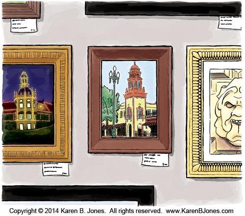
Here’s a spot illustration I did for the August issue of 435 Magazine. It goes with an article about an art fair at the Country Club Plaza in Kansas City. The image in the frame is one of the iconic plaza buildings. 
Actually, I made two versions of this image. The one that they ran (above) was a version of this larger image (below).
Here’s the tear sheet: